The last year has seen a enormous amount of change at Panzura. In fact, you could say we’ve undergone a complete transformation since that day in May of 2020 when we started on a journey to do things differently.
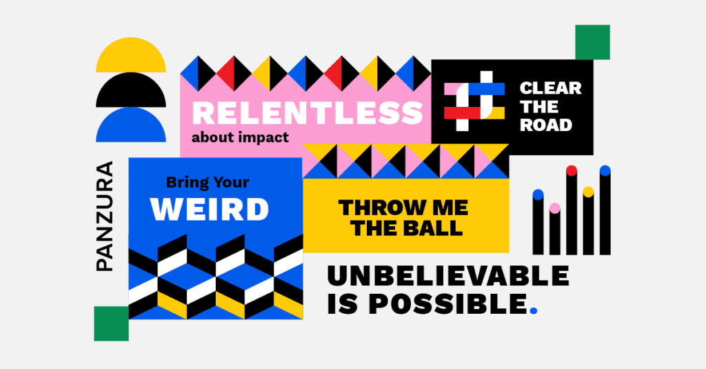
One of the first things we did was come up with a new set of values: Relentless about impact, Bring your weird, Throw me the ball, Clear the road, Unbelievable is possible.
These ideas help us make sense of everything that goes on at Panzura, and they also help us think in new ways.
Our new mindset meant we also wanted our brand image to reflect the big changes that have taken place at Panzura. Our old logo and design just didn’t feel right anymore. We needed to create something that conveyed the innovation, energy, reliability, vision, creativity and collaboration we represent.
Our marketing and design teams took a look at our previous branding and gathered feedback from employees who were very honest. You might even say “brutally honest,” but we Panzurians like that! They pretty much universally hated the “Z” in our logo and it’s “crazy, spiky shape.” Most of them thought the color blue was overused. Overall, our logo and imagery made us look too much like a startup, and not the high-growth market leader we have become.
It was great feedback and really helped us chart a path to something totally different and new. Our job was to create a look and feel that was more strategic, yet also emotional and sophisticated. We set about to design a brand that captured our ability to radically simplify and modernize hybrid-cloud data management in the enterprises. It also had to capture who we have become as Panzurians.
Inspiration to invention
You can’t take Panzura and whittle it down to one thing. We serve companies of all different sizes and industries by providing solutions to a variety of different problems. With Panzura, our customers don’t just reduce the complexity of their data infrastructure, they also improve productivity, increase the security and resilience of their data, and make it easier for employees all over the world to collaborate and gain insights using futureproof technologies like AI and deep learning.
But that’s saying a lot, and we had to ask ourselves how to distill the underlying power and complexity of Panzura, and turn it into a visual representation. Our answer—textiles.
Fabric is produced by weaving or knitting together threads, and threads are created by twisting together fibers. A fiber—once twisted, woven, and sewn with other fibers—can create a variety of products: shirts, pillows, blankets, curtains, boat sails, space suits, etc.
This is the metaphor behind Panzura’s logo. The mark is a zoomed-in piece of fabric which represents many separate things—our technology, cloud providers, and partners—being woven together to create solutions for our customers.
Easy enough, right? It’s a nice metaphor, but we also wanted something clever that represented three principles that exemplify our technology in a simple way: Smart, strong, and secure. Within the mark there are some hidden easter eggs that represent these things. When you gray out the right segments, you can find a letter “P” for Panzura.
The plus signs symbolize growth, and how by managing data, Panzura helps companies scale their businesses. The equal sign represents the symbiotic relationship Panzura has with our cloud providers, partners, and clients. That seems pretty smart if you ask us. Finally, for strength and security, there is the symbol of a knot.
Color captures imagination
The old brand relied heavily on shades of blue and gray; which felt corporate and outdated (think old-school Facebook and MySpace). The new color palette needed to be bold to match our new personality and reinvigorated values. We decided to keep the blue and yellow of our previous logo as a nod to Panzura’s past, but expanded the palette to be more dynamic and versatile.
Taking the blue and yellow and adding in red to create a primary color palette felt like the obvious choice, because those colors (and a lot of the other elements) tie back to color palettes used in famous periods of design history like the Bauhaus and De Stilj movements.
This lends the brand some timeless authority.

To get a little nerdier, in color theory, all the other colors are created by mixing primaries. We really liked that metaphor for Panzura, because by mixing our product offering with different cloud providers, industries and partners, we are able to optimize new solutions for different markets and companies.
In addition to the three primary colors, we use black not just for type, but as a design element. Black gives the new branding a sophisticated edge. Pink is the last main brand color which adds some quirkiness to our otherwise traditional palette. One of our favorite values is “Bring your weird,” and pink represents that mindset.
So there you have it. Sure, there were a lot of other considerations and discussions that took place. Design is not an easy task, especially when you work with a group of super-smart, dynamic overachievers like we Panzurians!
But, when we hit escape velocity on the old Panzura, it was absolutely clear that we had to create something new and different and bold. We think we’ve done that, and we hope you will agree.
Welcome to Panzura, refounded.